Cedric Jocelyn


Descriptions
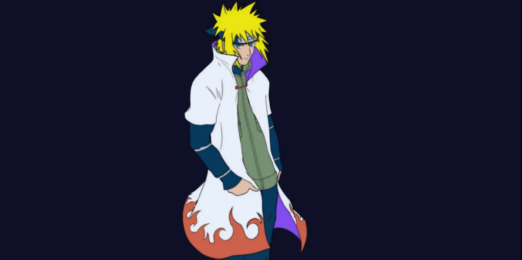
Neverland
I used Clip Studio Paint and Indesign for this book cover, CSP for the art, and InDesign for the fonts. After finishing my art I imported it over to ID and continued experimenting with fonts and different colors for it(this turned out to be the main issue). Each tool I used in each software worked greatly in making the final version of this piece stand out more than usual.
I had a lot of good references for my background and I made sure that I incorporated colors for my setting to fit the theme perfectly, with nice green cliffs reaching towards some white and snowy mountains just shy of an almost dry atmosphere. The character itself was all done from the top of my head so I always thought that it would be the most controversial part of this piece but instead, my classmates love him the most when I presented this project. Each manga cover always has the title and volume as the biggest fonts in their piece so I did the same and left my name on the side as the smallest font there since the exit strategy would lead to it being spotted anyways.
I wanted my character to stand out the most and made sure that he was the most noticeable piece on my cover. I originally thought that leaving him faceless was not a good idea even for a project example but with the theme we were working with in class, I ended up being encouraged by both my teacher and classmates to do so instead. The idea that I could change the character, their face, personality, mood, etc. helped the book cover be more of an anomaly. This could also help the script and story too depending on how the author wants to make the character’s personality be, I could fit his desires onto his expression in so many different ways.
This was the piece I wanted the most critique on and luckily one of my classmates did give me some advice. Everyone else talked about the font which did need some changes but no one talked about the character so I thought that maybe he was still fine and shined just as much as he did when I originally designed him. Luckily one of my classmates suggested that I add the same amount of detail to the character as you did to the land and ocean. “Finally someone took a bite at the illustration and not just the fonts.” I thought. But also why him though he should be perfect in his current position I thought, he was the one who was closest to the sun, therefore having fewer shadows on him makes sense since there were fewer obstacles out there in the sky to create the shadows. But after some thought, I realized that he was right and made those changes eventually.
I decided on scrapping the original title’s font and colors and simply just making it black so it can be consistent with the vol and author section. The idea that the title needed to be just as expressive as the land and character in terms of color was a bit too bold and only made visibility and readability poorer. Then after that, I looked at my character, just because he was in the sky and closer to the sun, that did not mean that he was immune to shadows. He is still in front of his wings, his neck is underneath his chin and sweater, and the wrinkles he makes from his movements on his clothes also have some hierarchy over the slight parts that they are covering by being pushed up on, the shoes are behind the pants, etc. In the end, I realized how much I had forgotten about the basics of art when it comes to shadowing and became very grateful to my classmate for this advice. I added the shadow details on pieces of his clothes and body but not too much because he is still in the sky and my original concept of him being closer to the sun still stands, nevertheless, the change ended up helping more than I thought it would.
This book cover project was one of my favorite projects, it is the closest thing there is to the line of work that I want to pursue. The background works so well with the foreground; the detail expressed in it is one of my favorites. The sense of thrill that the character gives you with the wings on his back just makes you want to go on an adventure and the imagery that the colors incite(especially the wings colors), just gives you crazy fantasy vibes and that was exactly what I was going for.
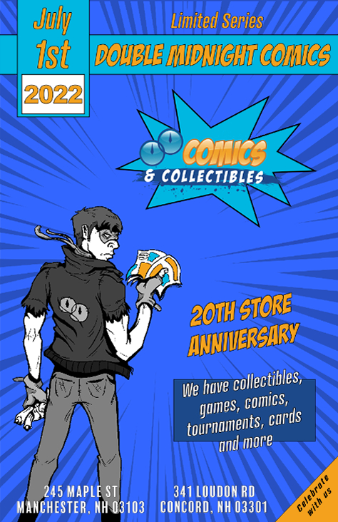
Midnight comics flier
Used Clip Studio Paint and Indesign for this piece. Indesign helped a lot with the fonts and comic effects in this piece so most of the work was done there.
This one is a more simple design that focuses on showcasing the knowledge of basics in design. The use of Typography, spacing, color composition, and consistency are all there which help the piece stand out more than the sketch in this flier.
The point of this piece was to make the use of fonts and design elements as a stepping stone in order to overshadow the sketch which still works to support this flier well, but the main point was still to showcase that even these elements can stand out more than a well-done sketch or sketches sometimes.
This time I was able to critique my classmates more thoroughly, but at the same time, I received a lot fewer critiques myself. Only one of my classmates analyzed all my pieces and critiqued them all with great feedback that showed me how well she analyzed my work. I was open to any suggestion and did the exact changes she told me to make only because personally, I had no qualms with this piece.
As my classmate suggested, I raised the quality a bit. I also got rid of the double midnight font over the comics and collectibles section since it was too small to read. But also because the comics and collectibles are what’s being advertised there and Double midnight is already the most highlighted font in the hierarchy so viewers will know who’s advertising this flier, therefore having it there twice is unnecessary.
In the end, this piece definitely helped me achieve my goal of helping to showcase that art is not my only main appeal when it comes to my design skills. Using the basic elements of design I can make a wide variety of my works look appealing in many different ways.
Free Comic Book Day
For this art piece, I used Clip Studio Paint, Indesign, and Illustrator. I mostly used Clip Studio paint to sketch my piece and Indesign and Illustrator was used for the fonts and images. I am fairly confident in my art skills and just like with my infographic, this piece demonstrates my ability to import my work into many different softwares to edit and improve them.
I mostly focused on my art for this one, in terms of design aspects, I used color very well to establish the characters and keep them from feeling like a molded and mixed crowd that can’t be distinguished. I applied hierarchy very well with the fonts and images to ensure that each draws the viewer’s eyes and put the logo at the bottom left this time because in this scenario if it was on top, it would mess with the hierarchy, the exit strategy will help it stand out more in this case.
The reference I used for the crowd really helped bring out most of my art’s detail. The most expressive thing I did were the books. I tried to use graduation as a theme for the free comic book day event to help it stand out as more than just a day where they try to attract new readers to independent bookstores, but as a day worthy of celebration.
Once again I was very much so open to criticism and especially for this one. Luckily the art section was not what was the biggest issue and that makes me happy since it is what I spent the most time on. Instead, it was the font that needed some editing because, in its current state, visibility was very poor.
After receiving this critique I focused mainly on the date, time and address. I took the advice that my instructor and classmates gave me and put a drop shadow onto it. I could have easily done this in InDesign or Illustrator, but instead, I experimented in CSP instead and realized that I could make my own drop shadow with layering alone. I could have left it at that, but I also wanted to see what it looked like if I tried to mimic the free comic book day font’s colors for repetition in another revision and consistency.
This piece is a wonderful blend of colors with a very neat theme that adds to it and makes it stand out more than simply applying the event day font design by itself. The colors all stand out and complement each other and they do little in terms of getting in the way of the artwork itself I assure you of this. They are simply there because of hierarchy and the need to advertise the event. But if one wishes to see the full artwork with nothing in the way, a quick revision can always be done.
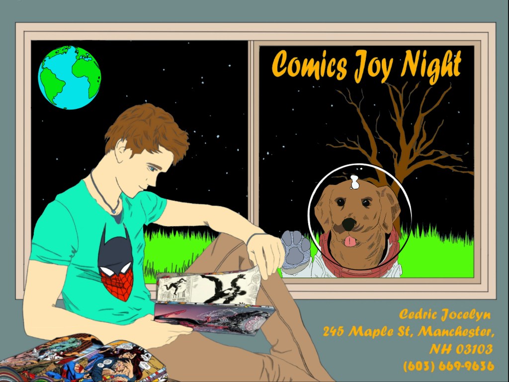
Space Comics
My instructor told me that pieces like typographic portraits are tough sells and including it would be a bad idea so I decided to follow along with those instructions and move along with something else. I went and pulled up a piece I had been working on with my logo design in mind but also wanted to use to advertise comics joy night. I used Clip Studio Paint, Indesign, and Illustrator for it. The logo was made in both CSP, ID, and AI and the fonts were ID. I used pieces that I worked on from all three softwares and tried to see what I could get from meshing them all together. But this was not a good idea, because, without a clear goal, your design will not know what direction it is heading in.
I used layers to organize most of my pieces, the colors were supposed to be light but somber to fit the quiet and cool theme. The fonts I used were also from the same client example we were given for the free comic day event clients, so deviating from the character and colors of the original was out of the question. The logo was original so the size was up to me but the placement was definitely necessary and so I put it on the top left(not a good idea).
I thought of creating a theme that revolved around escapism and losing yourself in a comic and its story. With this in mind, I put my character in an isolated room and drew him reading a book. I then meshed and transformed the comic assets that I could use into the books to make it look like he was reading said assets. I gave him a mix of a Batman and Spiderman T-shirt character to illustrate that he is a fan of both Marvel and DC to stay away from potential arguments and backlash. Finally, I gave him a night blue Fall background setting underneath the stars because those were the current settings we were in and I wanted to advertise the here and now.
I did not receive any critique from this one since it is new so aside from what I said in the first paragraph, there is not much really that I could think of that was wrong. I am open to critique of the revised version and would definitely like to know which one others think is superior(revised or new, not the two different revisions).
After noticing how inconsistent this piece was in its message and how focused it is on advertising rather than inspiring I decided to make some major changes. First off, I would remove my logo, there is absolutely no need for it and it serves only to promote myself and not my clients and their event. Next, I decided to dive deeper into the idea that the character is immersed and isolating himself in his comic book frenzy. I placed the earth where the logo used to represent his potential distractions being a space travel distance away. Finally, I put a dog in a spacesuit, to emphasize the fact that they are in space on a potentially colonized moon area, outside the window trying to get his attention to once again emphasize how lost he is in his world of comic books.
In the end, I ended up loving this piece more than the original, and feel like I want to look at and revise more of my pieces in the future to improve them. The details in this piece are more astounding than many of my other pieces. The messages being conveyed in it help advertise my client and their event even more by promising its audience a night filled with comic book escapism. The imagery pairs up very well with the font message and the exit strategy lets them know exactly where they need to go to achieve this goal if they are interested.
Traffic Robot
Full Presentation:
This piece was one of my earlier projects in which I used Autodesk Sketchbook and google slides to present one of my characters. Being versatile in adobe software is very useful indeed because your colleagues will most likely strictly be using them too, but being versatile in the software that everyone has access to also helps, the wider your program field is the more versatile you will be as a designer in your field.
This traffic robot presentation goes over all the different elements of design it undergoes. From its shape, lines that make it up, innards, functions, color choices, etc. it is all there.
The goal of this project was to make an original design from all the references we researched but to also use that research to our advantage as much as possible. The most creative section of it for me was designing its innards and functions because the reference I used was mostly for its overall outlook. The color choices were also another way we were allowed to express ourselves.
I did not receive any critique in regards to this one from my class which is understandable, the project is very sophisticated and hard to understand and goes through a lot of steps. The project is also meant to create something original from the ground up, so how do you tell someone that their original creation needs some improvement when it is original and there is nothing much to compare it to? Regardless, I do remember the critique I was given in my class for this one and I was very open to any suggestions since I spent a lot of time on it.
The critique given to me was very good overall since the examples we were shown all had great detail in them when expressing the machine’s functions. I opted to focus most of my time in that department and ended up doing a pretty good job with it overall since it seemed to me like that was what my teacher wanted most of our time to be focused on. Our art skills were already very well known by this point, now he wanted to see how we would try to make an audience who had to create our character from the ground up(3D modeling and animation purposes) understand the inner workings of our subject.
I picked this project specifically because I remembered being praised by all of my classmates and teacher for understanding my task very well and showcasing how versatile my art skills are. I do not simply draw to please the eyes and create posters and whatnot, I can create many different things from the ground up and give you all the details that are required from the design. The character’s story can be summarized or extended if needed and the first paragraph is a good example of this. Whatever variation, unpacking, or breakdown is required of me to do, can, and will be done. Just like this robot, all my art and pieces can be easily taken down into small pieces, reworked, and revised from head to toe.
Guardian
Full Presentation:
Guardian was made using Autodesk sketchbook and the presentation was made using google slides. (Unfortunately, my classmates were somehow not able to see the presentations so I had to pick one myself. I will try to see if I can send submit each page separately as a png just in case my instructor cannot see it as well)
Using references from a variety of different creatures I had to create a new one myself just like with the traffic robot. This was a bit tougher because I had to pretty much mesh and envision creating new body parts and potential limbs for a new being. First comes the story summary of course which is not supposed to be long since the main assignment was the creature design itself. Giving it different color options at the end helps give the client different options to choose from. And each angle shown helps them envision the creature and 3D model it even better.
Like the summary said, the Guardian is supposed to be a creature that guards the gates to heaven like the angels in the bible. I took inspiration from the bible in this one to create an angelic-like creature that does the angels’ job instead. At the time I really wanted to create a character like angels guarding the gates of the Garden of Eden with flaming swords, but we had to do creatures instead, so I improvised.
Unfortunately, my classmates were not able to see this piece and I did not get any critique from them, so instead, I opted to think about the critique I was given by my previous classmates and teacher but that also did not help much since this creature was so well-liked by them that it was chosen as the creature that I would use to personally 3D model myself for a different class project.
In the end, this piece was really well done. Just like with my traffic robot, I was able to showcase how well I am able to dissect not just a machine, but a unique creature with its own skeletal structure too which also had to be done from scratch. Using presentations like this, I am able to portray how versatile and advanced my art skills are due to all the studies and practice my teachers and I have used to hone them.
