Cedric Jocelyn


Description
Infographic
For my infographic, I used both Indesign and Illustrator. Using both of those softwares I managed to organize my graphs around perfectly and manage all of their sizes and shapes correctly. In order to make things consistent I made sure they were all the same. And used Indesign to make the fonts similar to keep more elements of consistency. Being able to export and import projects between these two softwares and make changes to them is very good to have and that goes for much different software too.
I chose to focus on the colors that were given to me by our client’s tech crowd and made sure to use the logos only they provided to me. By using font sizes and styles that were also provided to me I was able to make sure my hierarchy was stable and organized. I looked at the images that were also provided to me and made use of graph one and applied it to my infographic as a similar section to others and organized it with its own header, icon, and detailed explanation.
I chose to do which social media channels are most commonly used because it looks to be the most versatile out of all the topics. The key findings were simple really it was all in the data chart, on top of that, each of the social media platforms that were on the data chart is very popular and well-known. It would not take long for anyone to research information on their overall history. When it comes to images, logos should always be either centered or on the top left or right corner, knowing this I experimented a little and made different revisions of my infographic to try to test out my audience.
When critiquing my classmates, I have to admit I feel like I may have been a bit too lenient with them. I must say I don’t think I quite understood how to respond to them properly and should have read the discussion post requirements more thoroughly. When receiving critiques, that is when I started to understand what I should have done better instead. I openly welcomed their advice and used it to further enhance my infographic, even if most of them were stating the same thing it still helped me improve it.
After looking at the feedback I was given, the first thing I did was make the changes that my classmates suggested to me(making the graphs bigger). Knowing that they would look at and review this again, I made different versions so that they could pick which one they thought would appeal to a wider audience and which one should be scrapped or edited again.
Aside from sizing, organization, and some font reformatting, I don’t think I see any other big changes. My project was already critiqued in my previous class and told what was great about it so I don’t really expect anything new this time. I made sure that this infographic was intended for visual learners, applied my spacing properly, and made sure that the colors were complementary to each other. I don’t expect to be judged on consistency since that is what I focused on the most.
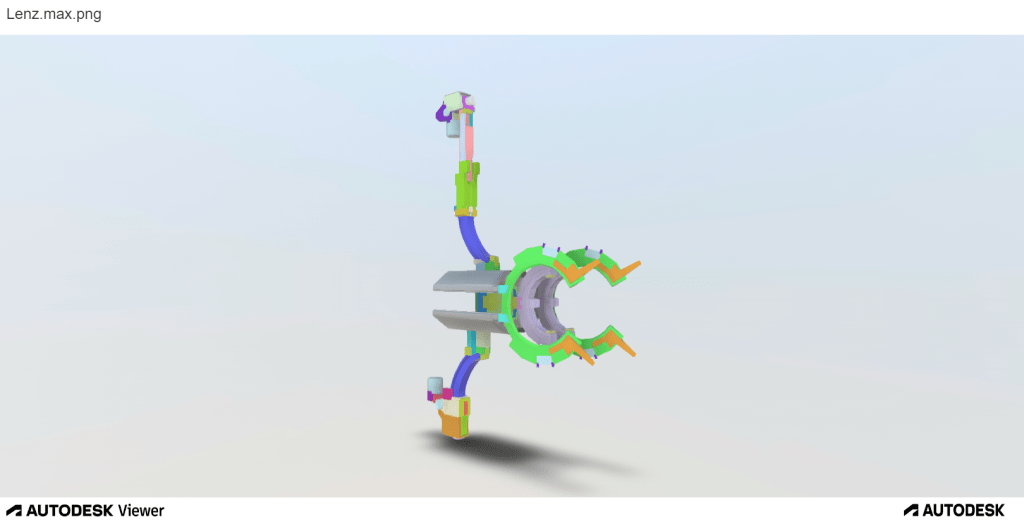
Lenz Bow
This piece was made using 3ds max and baked in 3D coat. It did not receive much critique aside from “it looks cool” which is understandable since most of my current classmates were not game design majors like me at some point. Its design elements are definitely complex even with its main reference being used. One of its biggest appeals is when it is animated, which is hard to showcase without a 3ds max animation file and that mostly is from the game and was not the main focus of this assignment. I wanted to express how much I loved the game Warframe so I chose to create my favorite weapon from the game as my final project for that class. Using the multiple angle screenshots coloring each separate piece differently in max to help distinguish each individual element and the extruded version just helps show how much time and effort was put into this piece. It was one of my best works when I was still a game design major. I had to put it in my portfolio since the main focus of my portfolio is to showcase how wide my skill set is, making this one a must.
Magazine ad
This magazine ad was made with Illustrator only. It was supposed to be a simple project that helped us showcase how well we understood the elements of design by creating a magazine advertisement page with the images and elements of our choice.
I did try my best to showcase how well I understood the elements of design in this one with complementary colors, good use of spacing, and hierarchy. But after reading my classmate’s critique, I was easily able to spot where many of my mistakes were.
Since I like gaming as a hobby, I chose Playstation controllers to be my advertisement’s main focus. I wanted to express how much gamers like neon colors and futuristic-looking tech and features. The game I wanted to show being played did not really matter to me since I play and love so many of them, so I chose a popular one that many knew like Fortnite. Since color was also a major part of how I wanted to express my love for games I chose two different colored controllers to help emphasize that point and also brought the topic back in the main font in fancy writing.
I definitely got a bit too caught up in my need for expression and thought about the audience less. The critique given to me helped me notice that a bit more. Before, I thought this magazine ad was a pretty nice piece that could easily be used to advertise the DualShock 4 controller at any time, but being open to suggestions made me realize that it needed major changes and was definitely not worthy of being used as a magazine advertisement.
I Changed the TV image so it’s more apparent that it is a flatscreen Tv and not just a floating monitor for the gamer audience trying to interpret it. As my classmate said, I removed the LED sign because the font is definitely false advertising since most gamers know that you can only use a DualShock 4 at home or on specific devices that support it with Bluetooth and most of these devices are not portable like a Nintendo Switch.
I used a different image for the Fortnite image that has a smaller font for the game’s name for hierarchy’s sake since the Dualshock controllers are what are being advertised, not the game. Just like my classmate said, I got rid of the PlayStation controller logos since Sony is already on the top right and they are the owners of PlayStation, therefore there is no need to advertise both the parent and child company.
I made the controllers a bit bigger so they stand out more as what is being advertised, this time they are about the same size as the TV rather than being smaller than it.
Finally, I changed the bottom font since the previous one had too many serifs which could be conflicting with some audience members.
This magazine advertisement piece is not the first of my works that made me realize that I was a bit too caught up in my own head to think of doing anything outside of it instead. But it certainly was one I would not have noticed if one of my classmates did not help point out many of the flaws in it. In the future, I will definitely try to get opinions from multiple people and not just my superiors to see if they can spot some potentially damaging aspects in my work.
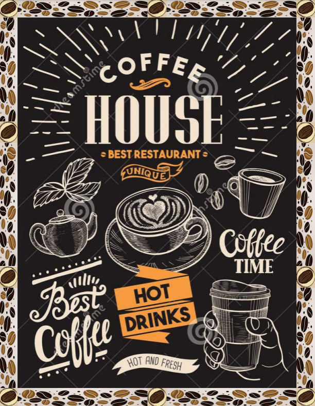
Coffee Hour Menu
Full menu:
This piece was made using Indesign and Illustrator. Indesign to help create consistent borders and Illustrator for the images and shaping them around each page. In terms of refining it though, surprisingly Clip Studio Paint was the software that helped the most.
The color composition was the least used element in this piece. Spacing and consistency on the other hand were the most used in order to make the menu look professional.
This piece was the one I was looking the least forward to in terms of critiques because I honestly could not find anything wrong with it. But little did I know that it would be the piece I would work on refining the most. Not just because of the page length, but other critique and backtracking factors as well.
Once again my classmate helped me notice things that I myself personally would not have noticed simply by glancing over this piece again. Using the advice that she gave me, I not only fixed a bunch of errors in the menu, but I also found new errors that I had completely missed before.
Like my classmate suggested, I raised the quality of the images that looked a bit lower res like the bread, beans, and ice cream, using CSP tools, I sharpened their edges a bit which helped them look less transparent or low res. Next, I edited the border a bit for consistency by removing the green squares and replacing them with the coffee beans. When I realized that the border was also very inconsistent and some of the edges were either cut off or digging into the menu page a bit I adjusted those mistakes(don’t know how my previous instructor and I missed that).
It is supposed to be a multi-page menu with big fonts that makes everything easy to see and read so I made it into a multi-page pdf.
This menu was one of my favorite projects and I thought that it was literally perfect for the task at hand. Little did I know that nothing truly is perfect. This menu was a perfect example of how important looking back and refining each piece to correct their mistakes is, and it definitely will help me keep a close eye on my future work in the future.
